Hello and welcome!
Thank you for taking the time to consider me for a role with Sifted. I created this landing page to highlight the experiences that most closely align with the Presentation and Marketing Designer role. Afterwards, I invite you to browse the rest of my portfolio to experience my full creative skillset and various artistic pursuits.
If you have any questions, please reach out to me at quinnmoss.creative@gmail.com.
Graphic Design
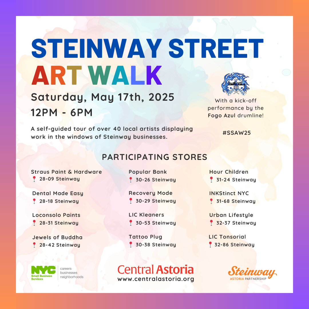
Community Liasion, Central Astoria LDC
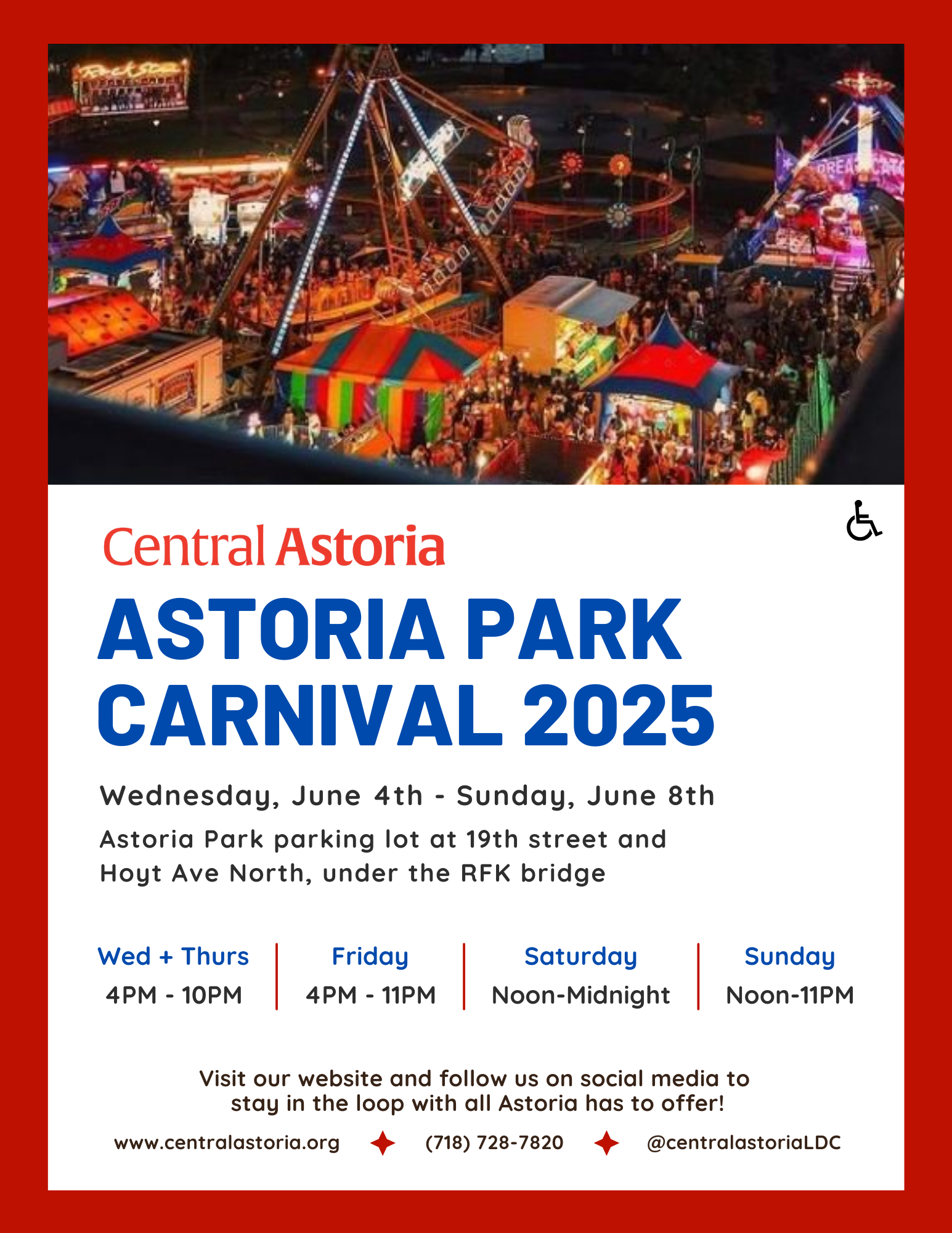
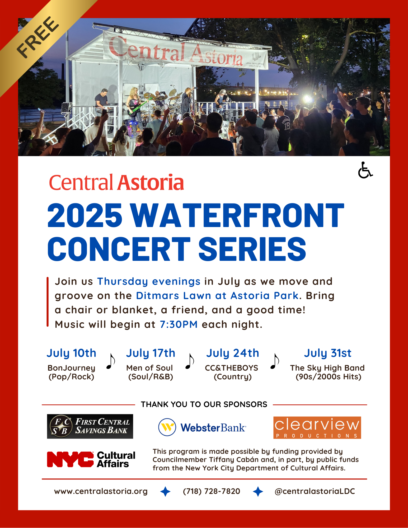
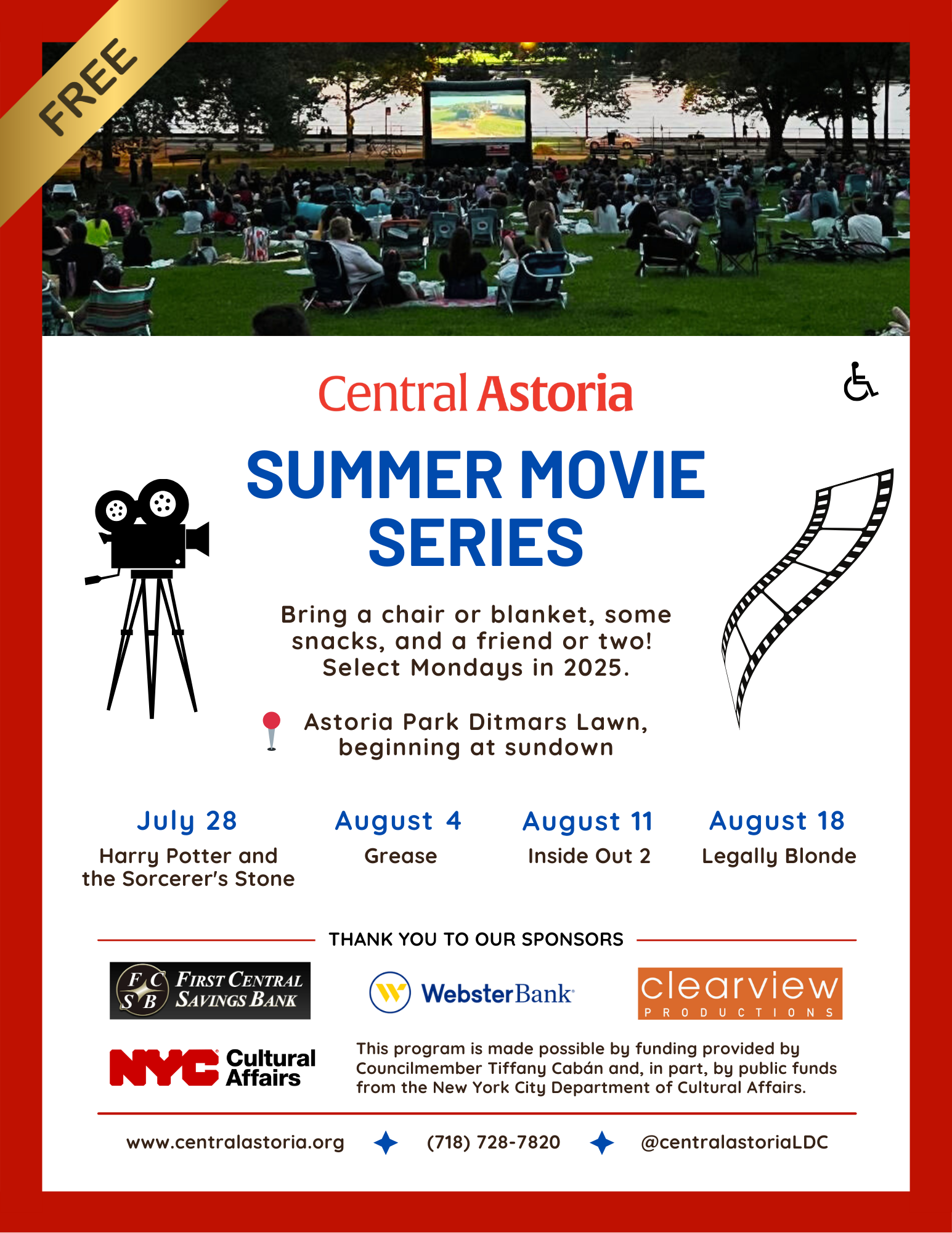
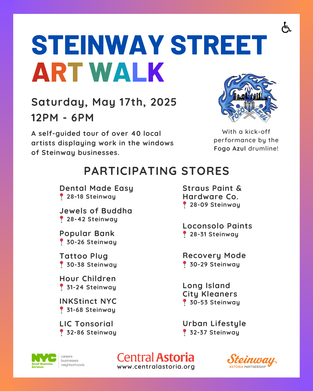
Prior to my arrival at the organization in 2024, the brand underwent a redesign with a new website, logo, and colors. I used those existing assets to give Central Astoria recognizable and cohesive branding across the web, print, and social media by creating a Canva Brand Kit and accessible templates the entire organization could use.
I took the red, blue, and tan of the website, modified slightly to adhere to WCAG accessibility and contrast standards, and created a repository of templates for each of the summer events the organization hosts. I wanted to delineate between the different types of events the organization hosts (Park events, street events, community cleanups, etc.). Since these pieces of media are created to serve an entire community, both digitally and in print, I focused on accessibility, conciseness, information hierarchy, and way-finding. I used fonts and layouts to leverage brand recognition, and relied on color and imagery to help clarify intention.
Software used
Canva, Notion, Google Workspace, Constant Contact, Eventbrite, Squarespace.


Freelance Print Design - Garden State Equality
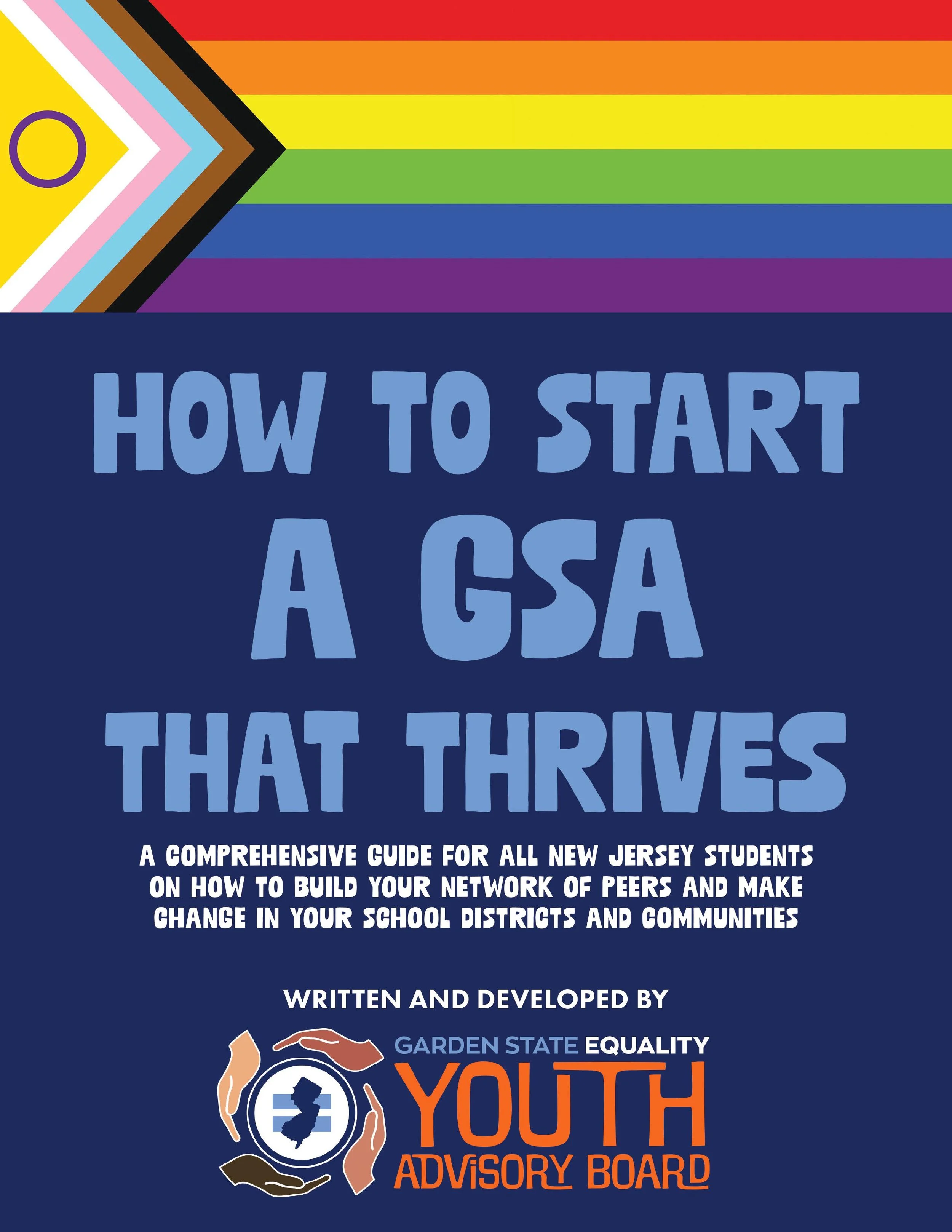
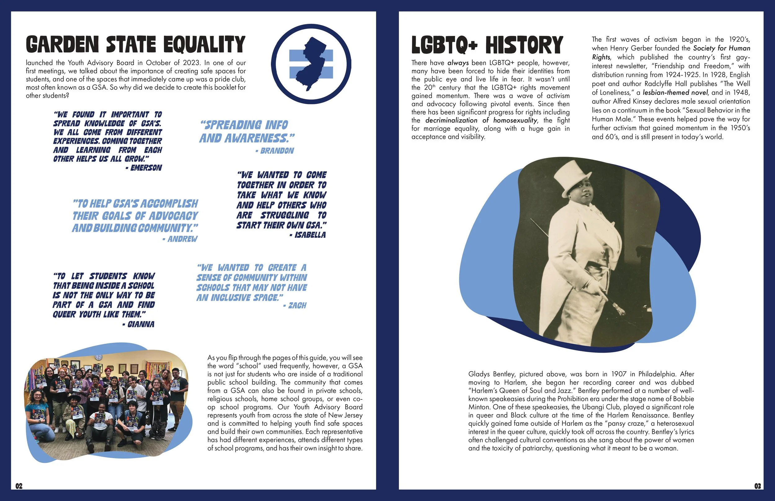
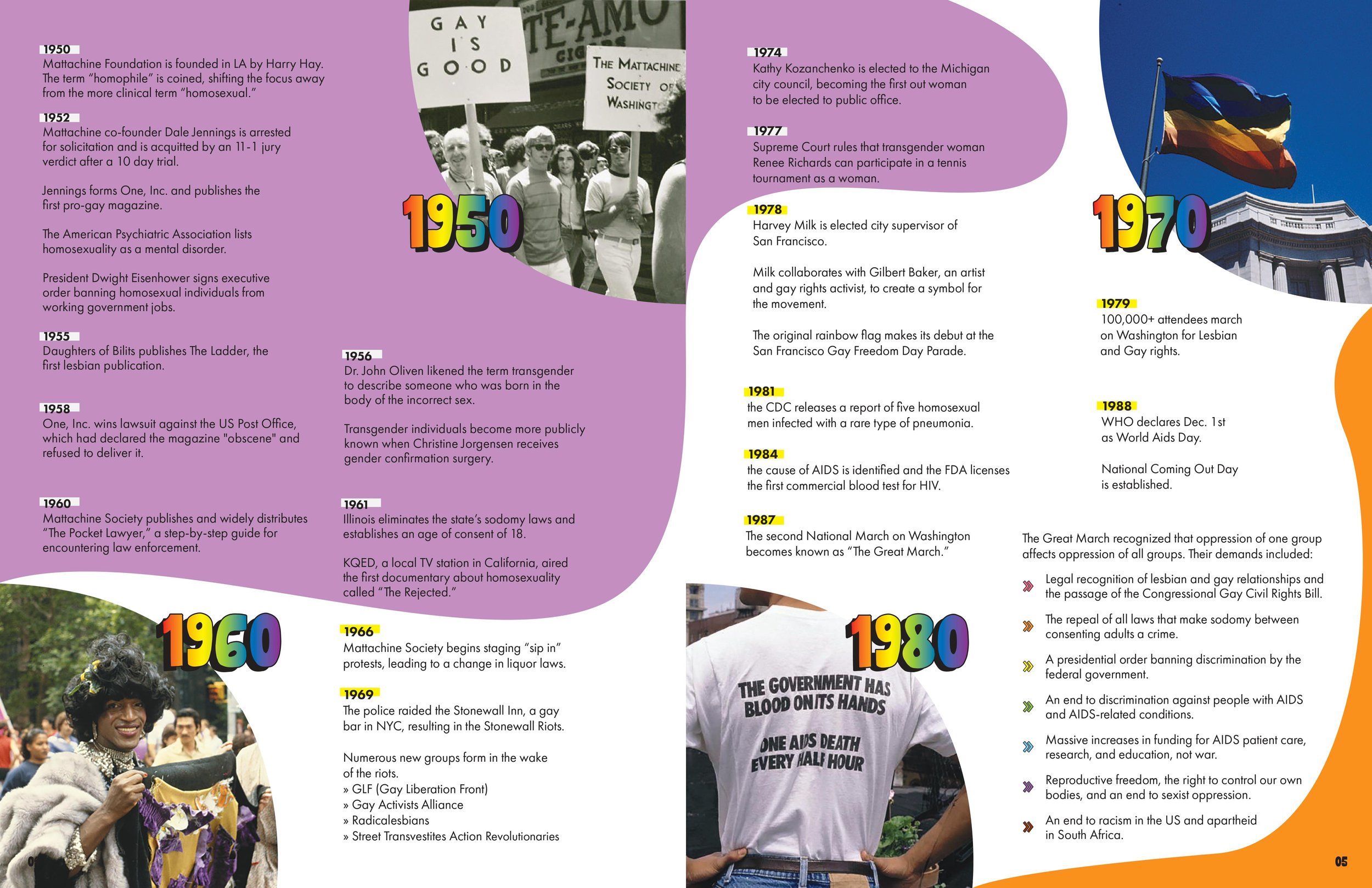
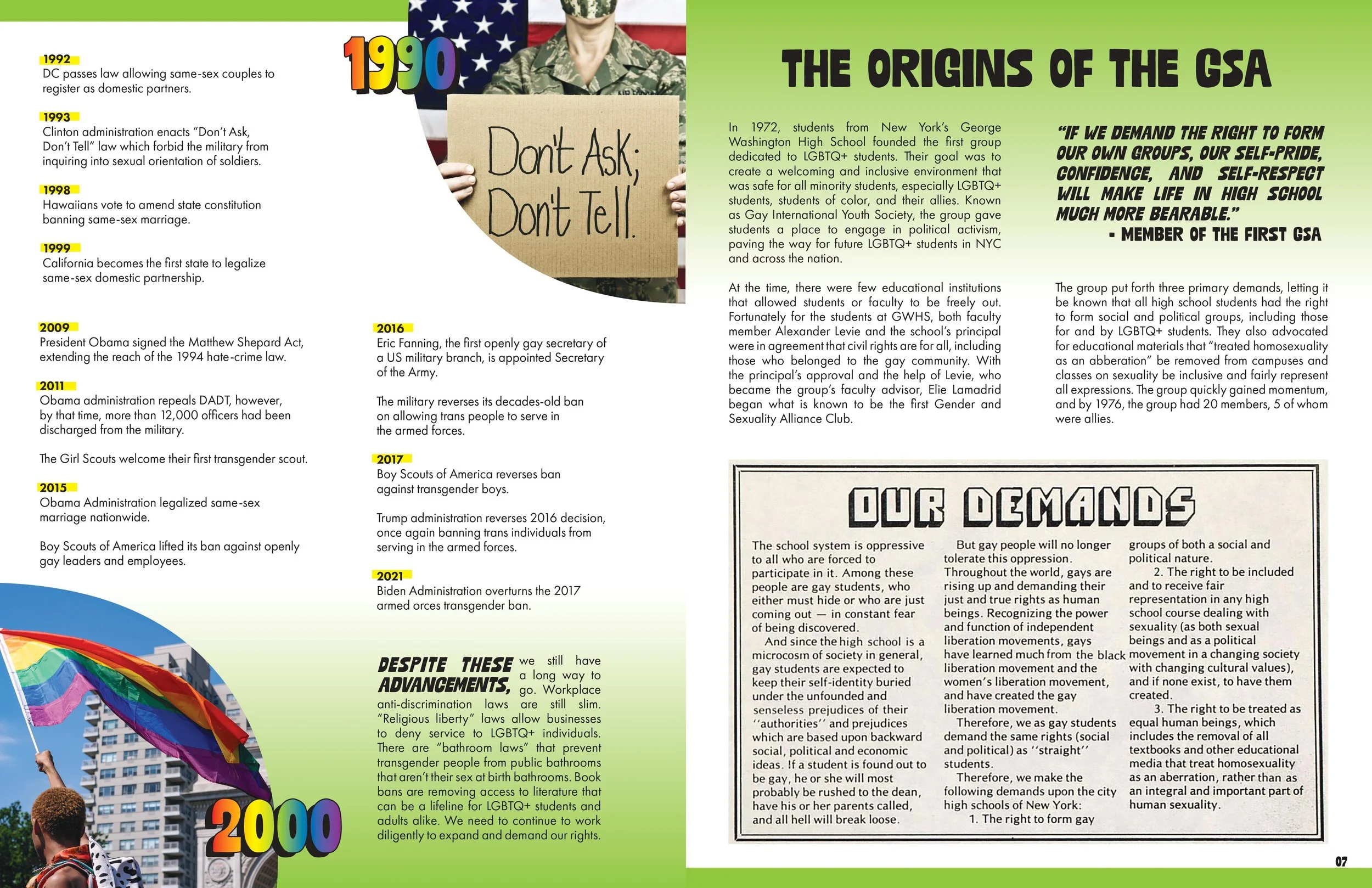
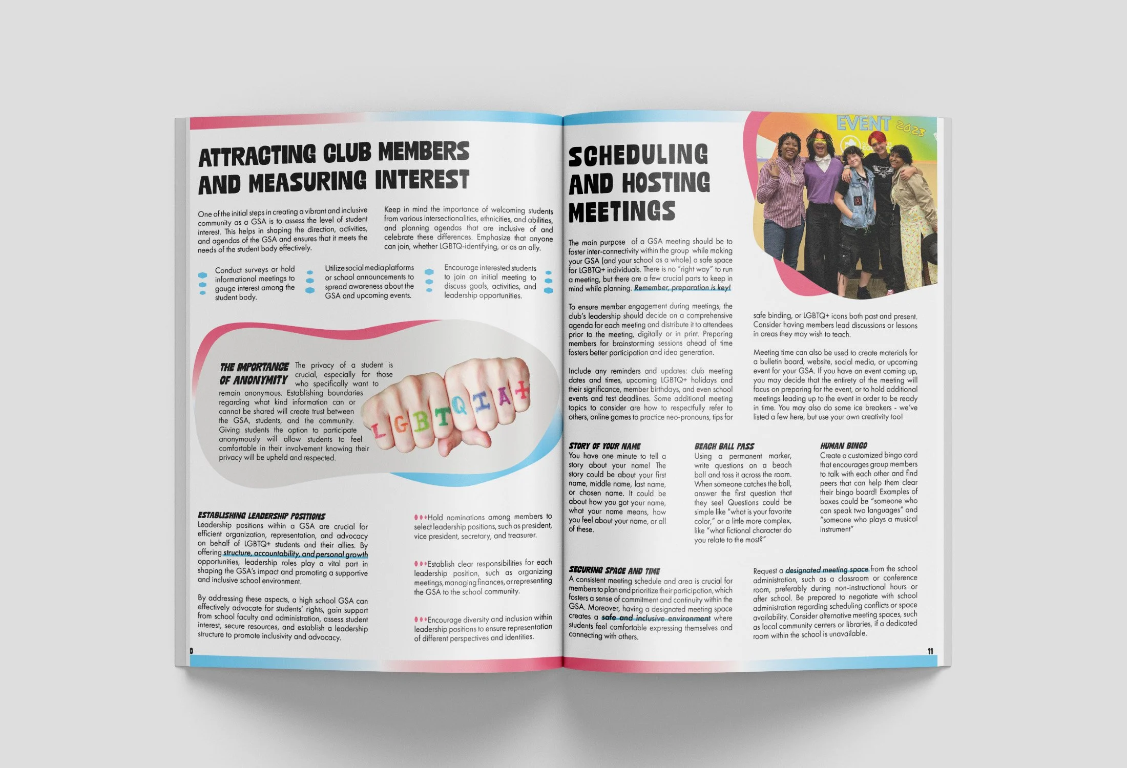
In May of 2024, I was contacted by the Director of Youth Development to design a printed booklet for their Youth Advisory Board’s Guide to Starting a GSA. Given a basic PDF that had been written and organized by the YAB and a deadline of just three weeks, the turnaround was tight but the results were absolutely worth it.
Wearing the hats of copywriter, photo editor, layout designer, and production coordinator, the final product was a 24-page polished booklet that both the students and I were immensely proud of. In addition to the stellar keepsake and portfolio piece I gained, I learned a ton about LGBTQIA+ history and the incredible dedication of the high school students involved in creating positive change in their communities.
Software used
Canva, InDesign, Google Drive


Production Designer, Wellcom Worldwide
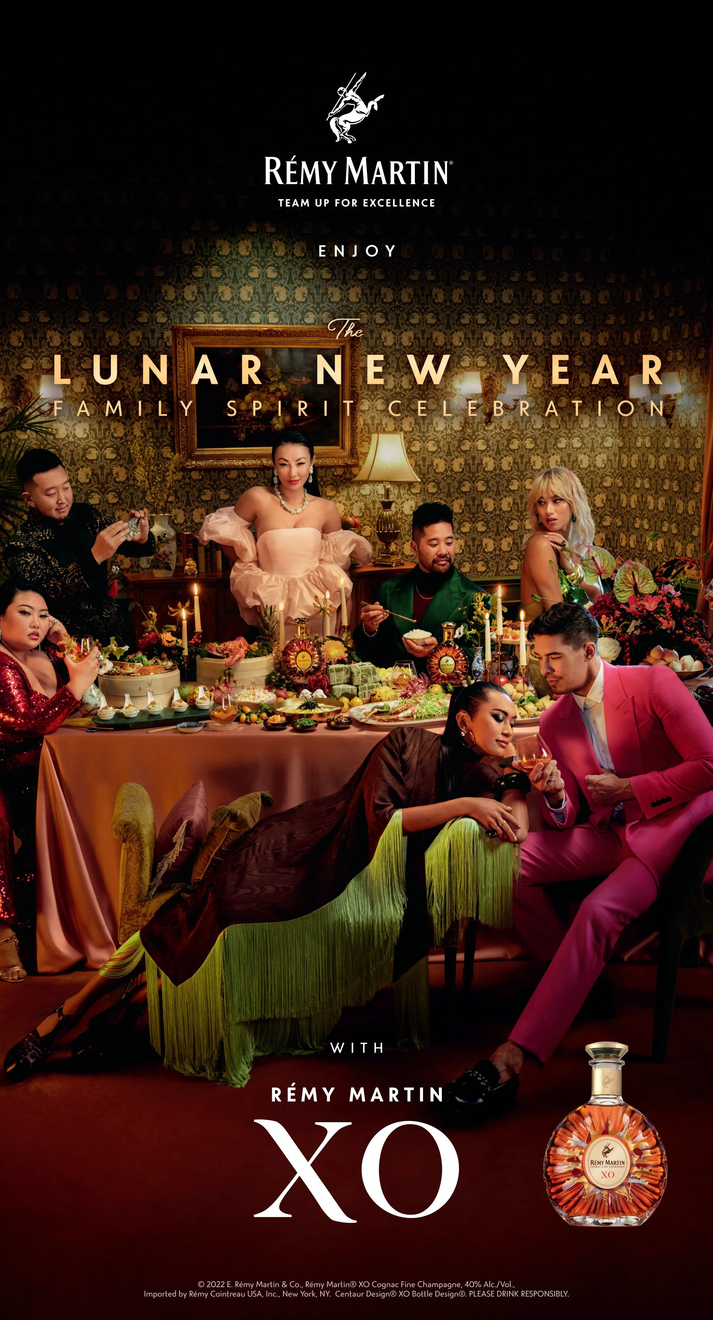
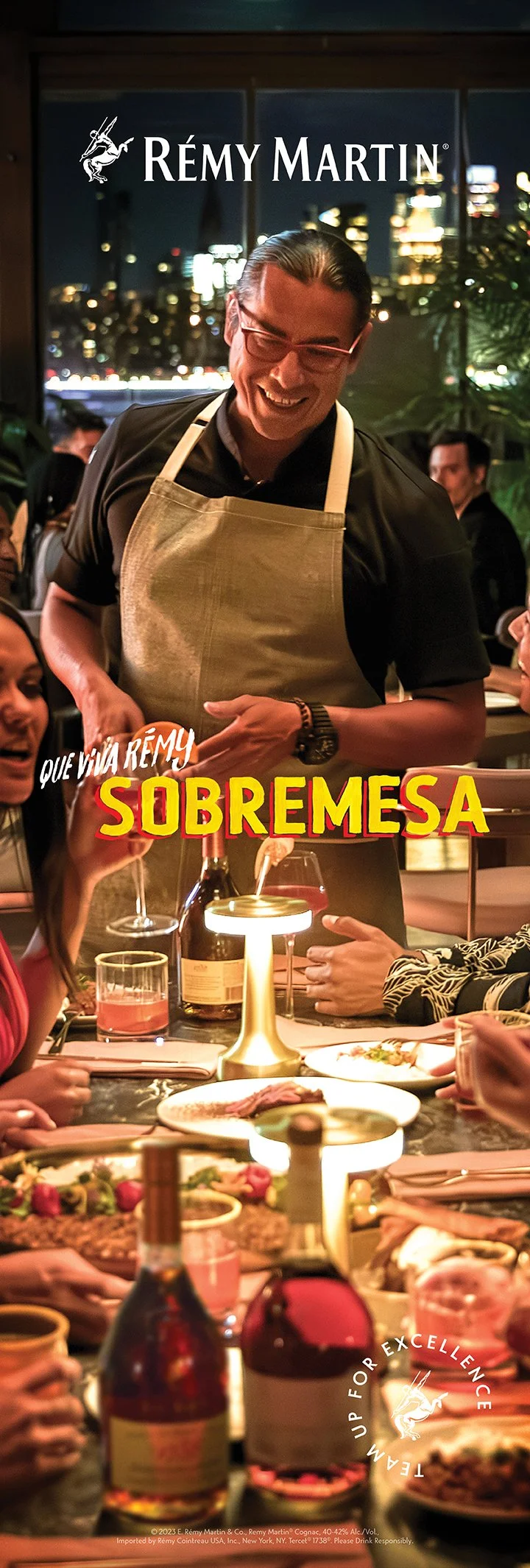
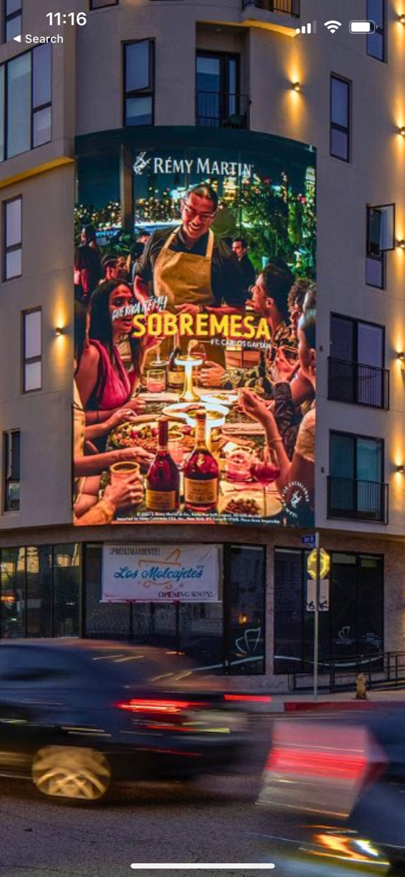
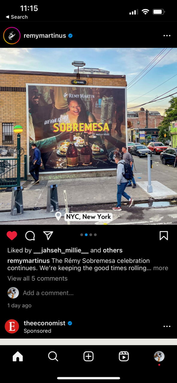
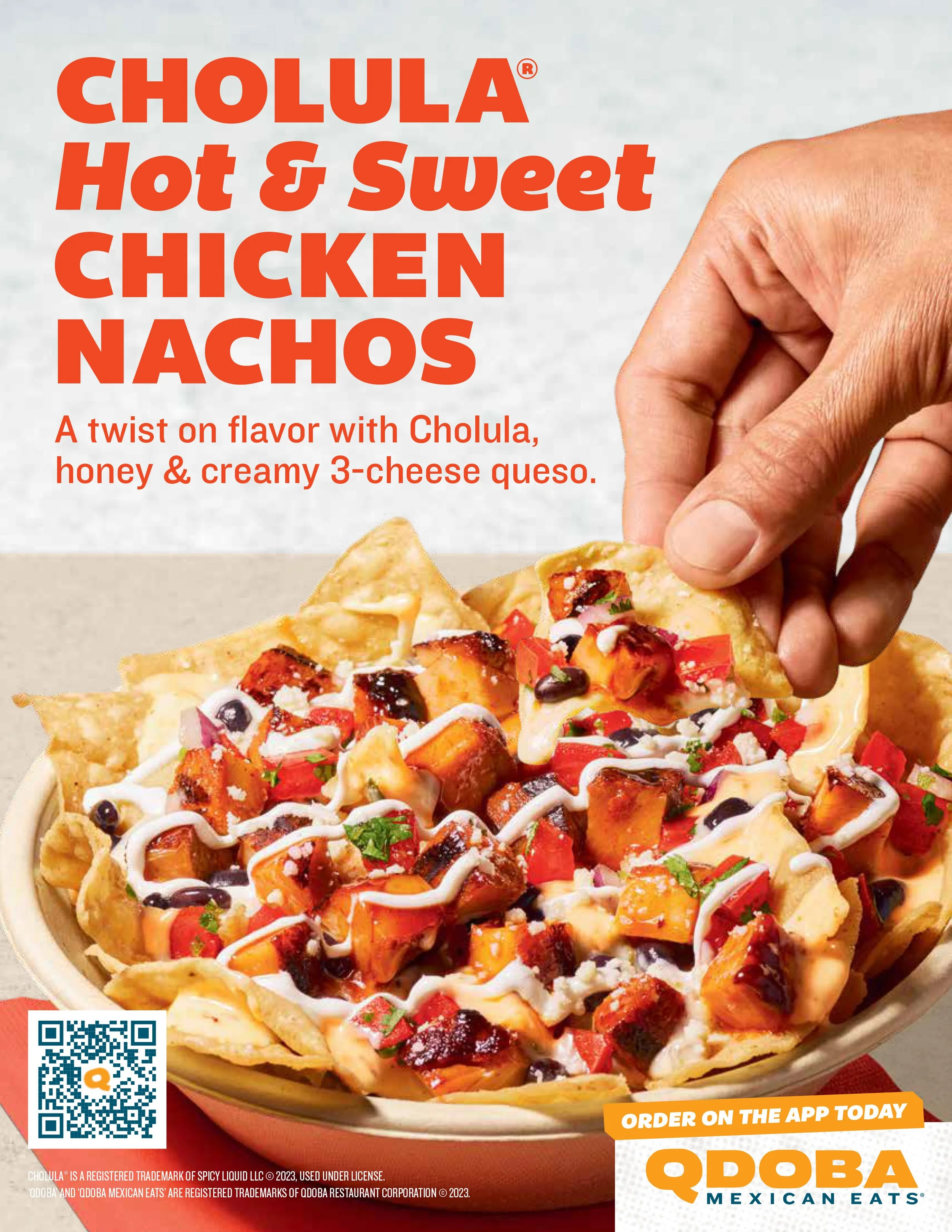
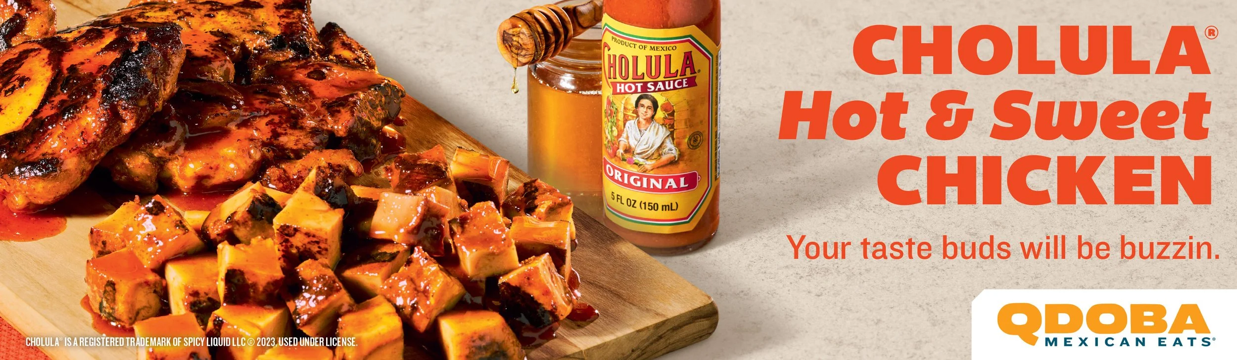
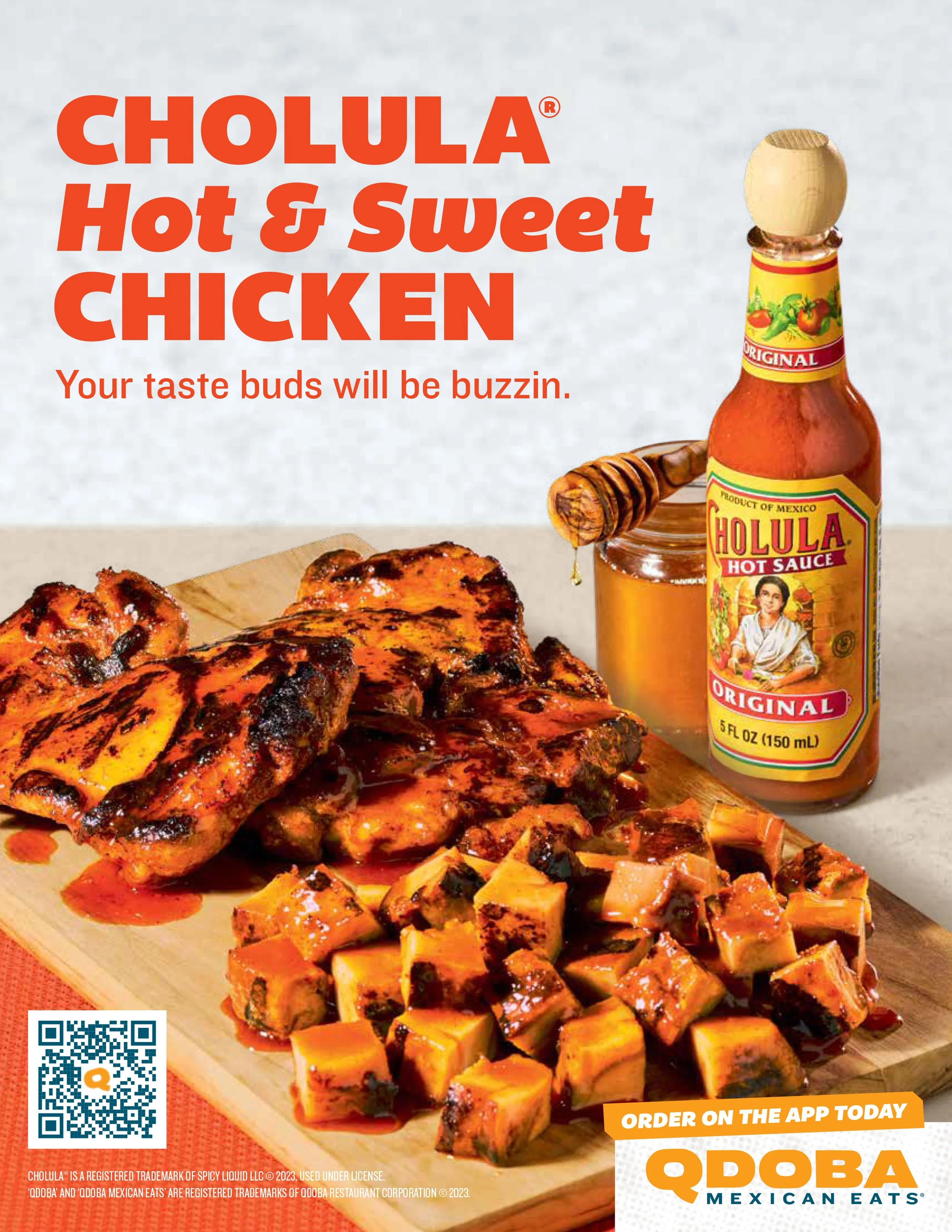
My primary responsibility in the production studio was to translate briefs into print- or display-ready artwork. The day-to-day usually involved 1–4 client projects with minor edits, or weeks-long single client projects. I worked on presentation design for Meta’s internal marketing and strategy teams, in-store signage and social posts for QDOBA, mall signage for Simon Malls, or Rémy Martin’s campaigns as seen here. Additionally, I learned how to develop static HTML banners using Visual Studio Code.
It was here that I learned to be pixel-perfect, precise, and how to “do it fast and do it right.” One of my favorite parts was seeing my work “out in the wild” on buildings, restaurants, and across the web.
Software used
Photoshop, Illustrator, InDesign, Slack, Google Workspace, Dropbox, Visual Studio Code





Product Design & UX Research
Pratt Institute Certificate Course - App Feature for 7Shifts
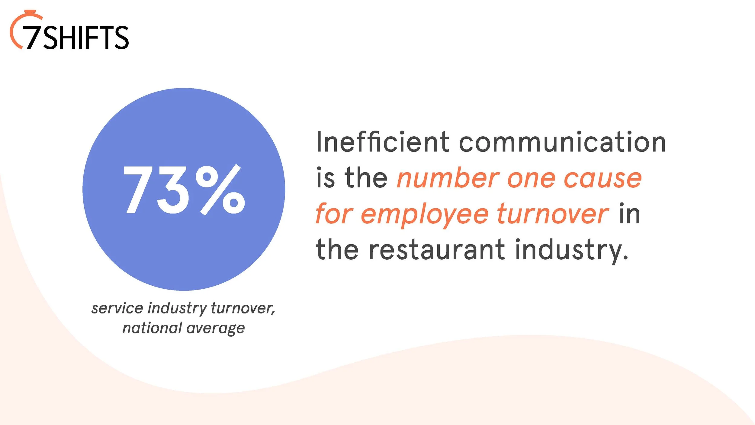
Being restaurant professionals, you understand firsthand how challenging it can be to obtain accurate menu information. When the ever-changing specials are scribbled on crumpled notes and covered in sauce, accuracy, efficiency, and occasionally safety can be lost along the way. A lack of effective technological solutions can often explain the problem managers have in finding a sufficient way to disseminate information.
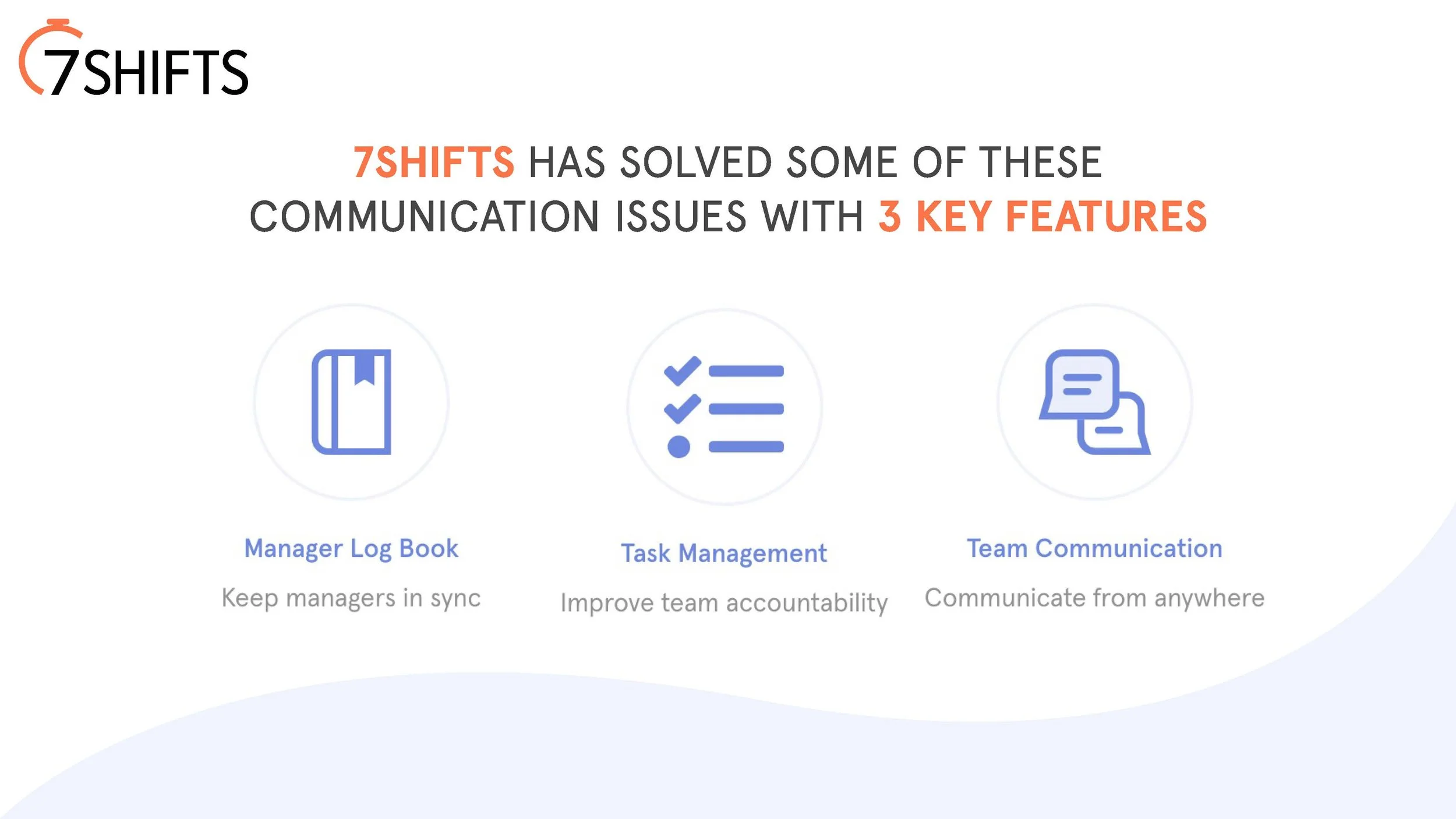
To combat the issue of inefficient communication, I created an app feature for the 7Shifts platform that allows chefs to input menu items while keeping both the front- and back-of-house staffs up to date with the information they need to successfully do their jobs.
While conducting this course-long project, I was fortunate to have a friend already using 7Shifts. I borrowed his tester login and was able to utilize the app to obtain screenshots, understand it’s current capabilities, share with others to watch how they would navigate the app, and identify a gap that could possibly be filled in their technological offerings. The following slides & videos are the project I presented to my class and instructors.
Software used
Figma, Google forms, Photoshop, Illustrator



FLOW 1: Adding a menu item
The first video is 45 seconds and moves through 3 screens:
1. Adding the item details (name of item, location, meal period, category, and a recurring option to set the item’s frequency and days). The date is automatically set.
2. Adding the ingredients, description, and directions. The ingredients are linked to the inventory and POS systems so that both the front- and back-of-house are able to see accurate pars for the items.
3. Adding an image, then saving the new item. The screen toggles between front- and back-of-house views to indicate that both work teams have the information each needs to do their respective jobs.
FLOW 2: Employee view
The second video is 9 seconds and shows 2 screens simultaneously.
Each screens shows what happens when an employee clocks in for their shift and receives a notification of the shift’s lunch special. Where the prep cook sees a total item availability count [Q22] and ingredient measurements, the barista sees the price [$12], the description to tell cafe guests, and any allergy information.
The left screen shows a front-of-house (FOH) employee, and the right screen shows a back-of-house (BOH) employee. Each ingredient can be clicked on and the employee can see all relevant information to their position, as demonstrated with honey mustard in the video.